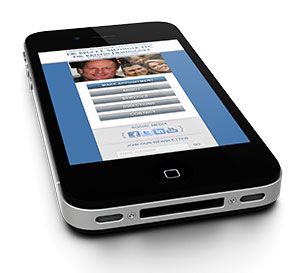
Dr. Bruce Salzinger Mobile Website Case Study
 With mobile devices taking over the world, can you afford not to have a mobile website?
According to International Data Corporation (IDC), almost a billion smart devices – 916 million to be exact – shipped worldwide in 2011.
According to CTIA, the worldwide trade association serving the wireless industry, the number of mobile devices in the US is greater than the number of people living in the US and all its territories. The CTIA goes on to say that the typical American home of 2.6 people has at least one smartphone.
Odds are that you are using a smart device such as a smartphone or tablet to read this newsletter or will use one for something else later today.
For this reason, one of our longstanding clients, Dr. Bruce Salzinger, owner of Chiropractic Healthcare of Buckhead, recently asked us to build a mobile website for him.
One of the reasons Salzinger chose NicheLabs is that we built his original website.
“The industry continues to morph, and this puts a high burden on your adviser to keep current,” said Salzinger, who added that NicheLabs’ expertise helps him “stay a step ahead of [his] keen colleagues.”
The other reason is that unlike many mobile website development companies who build user-friendly mobile websites that are just reduced versions of big desktop monitor designs, we design and build mobile websites specifically for smaller screens and the people on the go who use them.
“My traditional website is very data and image rich, and on a PC or laptop that’s fine,” said Salzinger. “But most of us are accessing the web on our handheld devices, and their screen size doesn’t allow all of that to be appreciated.”
Mobile friendly versus mobile designed
If you’ve ever tried to load a merely user-friendly mobile website on your smartphone or tablet, you know how long it can take. People who use mobile websites are often seeking just the basic information, such as phone numbers, hours, basic services or driving directions. Waiting for all the bells and whistles of a big desktop website to load on a tiny smartphone screen can be so frustrating to someone in a hurry that they might give up rather than wait for the site to load.
If you ever choose to wait for such a site to load, the next thing you’ll notice is that your phone’s browser will reduce the type to a practically microscopic size in order to squeeze it onto its small screen. You can manually increase the point size, but you won’t be able to see the whole screen anymore.
What to do?
At NicheLabs, when we design and build a mobile website, we design the site specifically for a small screen. We include only the information a person on the go is likely to be seeking – just enough to fit the entire web page on a mobile device screen with no manual adjustments by the user. This lets us convey the content using large, easy-to-read, easy-to-use touchscreen buttons even on a small smartphone screen.
To understand what Dr. Salzinger was looking for, please visit his comprehensive main website at http://www.drsalzinger.com from your computer and try to imagine squeezing all of that onto a tiny smartphone screen.
Then from your smartphone, enter the same url and see the difference an authentically mobile-designed website can make.
The question isn’t whether or not your business needs a mobile website anymore. It’s really what format you choose. To be sure it’s one your clients and customers will want to use, please contact us at sales@nichelabs.com or call 866.413.7952
