5 Necessary Elements of a Great Website
There are literally millions of websites, and each year new elements and trends emerge that the design community embraces. While it is not necessary to include all of the following in your website, the more that you incorporate, the better. Here are 5 key elements.
1) Simple Navigation:
Navigation is the “GPS” of your website. It helps users get where they want to go. It must be simple and effective. Navigation menus must be kept to a minimum so you don’t overwhelm your users. A good rule of thumb is to have no more than 7 menu items. A best practice for easy-to-use navigation is to let people know where they are on the site by using a “hover effect”, which changes the color of the menu item that their cursor is on or over; or by using “breadcrumbs” at the top of each page – a clickable “path” that shows the website visitor where they are in the site’s navigation (see St. Matthew’s House’s website for a good illustration of how breadcrumbs work.)
2) Relevant Content:
“Content is king.” Having relevant information on your website is crucial, both for your visitors and Google. And with more content viewed by Google as better, your simple navigation becomes more valuable. Additionally, you can add the Search functionality to your banner or home page. Your customers should always be able to find information they accessed the site for with ease. Bennett Thrasher CPA’s website is a great example of this, because it provides page after page of informative industry and service oriented content.
3) Custom Images:
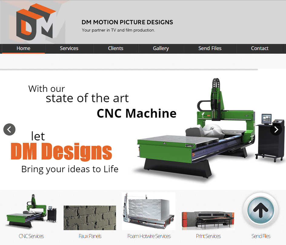
Today’s visitors skim through content more than ever, often skipping large sections of text. Take time to ensure that the images you select communicate your message. People love seeing information and data in action; with a collection of custom images, you will be unique and ensure users stay on your site. DM Motion Picture Designs’ website is a good example of how custom images in slideshow and gallery formats can be used to engage website visitors. Heavy use of colorful, scalable images is especially fitting for businesses that cater to a visually oriented industry.
4) Color Scheme:
Your site should include a color scheme that complements your brand and is pleasing to your target audience. Are you looking for bold, calm, fresh or conservative? Although you don’t want the site to be plain or flat, you should not include more than 2-3 different colors, particularly if your images or graphics are colorful or bold.
5) Call to Action:
Last but not least, you should include calls to action throughout the site. It must be determined in the planning stages what you want your visitors to do once they’ve visited your site. These calls to action will lead users to that specific action, whether it is to call or email you, volunteer information, make a purchase, or sign up for a service. With this planning, you can decide what goes in the banner, the footer, on the Contact Us page and on informational pages.
NicheLabs can help you select the elements that are right for you for both the desktop design and the mobile-friendly responsive design. We are a full-service agency for businesses that don’t have a CMO or VP of Marketing, or that don’t have the people or time to develop websites, manage SEO and digital/ direct marketing campaigns. As part of your team, we can create or enhance your website design and then do the development and search optimization.
For more tips and insights about attracting more business through website design and organic and paid searches, connect with us on Facebook, LinkedIn or Twitter or subscribe to our monthly newsletter to read summaries of our weekly posts.
Then let’s review your strategy or develop one. To speak with our team, please email us using our website contact form, or call us at 888.978.9254.
