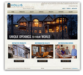
Hollis Architectural Products Case Study
 What kind of website do you build when your customers’ customers live in some of the most beautiful homes in the Southeast?
That was the question. And Hollis Architectural Products partners Frazier Hollis and Earl Rogers had the answer when they came to NicheLabs to build their first website, which went live last week. As their tagline says, their business is “Distinctive Windows and Doors.” As they wrote in their creative brief, their website had to be “high end, professional and artsy.”
Hollis and Rogers started with the premise that their website had to appeal to their primarily visual audience of architects, builders and designers. However, the changing needs of the luxury home building industry required more than just a beautiful high-end website with photos of drop-dead gorgeous homes.
Since 2007, the market had been tough on design professionals, builders, product manufacturers and their representatives. In fact, a search of the internet reveals websites showing portfolios of beautiful homes and products from companies no longer in business. Many remaining manufacturers have migrated toward online ordering processes, and the number of knowledgeable manufacturers’ representatives has declined.
Seeing a market need, Frazier Hollis formed his company in 2009 on the promise to offer clients “distinctive products, discriminating quality and differentiating service.”
Ultimately, they wanted a website that profiled the high-end windows and doors they represent while also conveying their utmost commitment to customer support before and after the sale and installation.
“We want to be seen as partners more than manufacturing representatives,” wrote Hollis in his creative brief.
Because they were asking clients to trust them with a high-value window and door package, they wanted the website to convey credibility.
“We needed a website that suggested stability, dependability and commitment to partnering with custom luxury residential architects, designers and homebuilders,” said Rogers.
The first goal of their website was to inspire a request for a face-to-face meeting after which a prospect would then save the site as a favorite for follow-up for his next luxury build.
One look at the breathtakingly beautiful photos on the elegantly designed new homepage is proof of the visual success of the site: http://www.hollisap.com/ A client testimonial in the upper-right corner adds credibility.
True to their original promise to serve the market differently, they dedicated separate website pages to “distinctive products,” “discriminating quality” and “differentiating service,” each with copy and photos to support their commitment.
The second goal was to provide processes, technical information, support materials and installation tips to the builders and installers. The Installers Page, which requires an access code, has such information, including short videos. Hollis AP wants the builders and installers to see them as true partners.
“I am very pleased with our website,” said Hollis. “It exceeded my expectations, and I have received several unsolicited compliments.”
Even if you are not in the market for a custom-built, high-end luxury door-and-window package, we invite you to leave the humdrum everyday world behind and visit http://www.hollisap.com, where commitment to all things beautiful is on display.
“I enjoyed working with the folks at NicheLabs,” said Rogers. “I felt like they wanted us to be as successful as we wanted to be … a partnership.”
