NicheLabs helps growing public health consulting firm promote its services to the world
When you’re a growing company providing life-changing services to governments and public organizations around the world, your website needs to be accessible and easy to use to people regardless of their cultural background and language.
 Public Health Practice, headquartered in Atlanta, Georgia, is such a firm. Led by Emory University Rollins School of Public Health Professor Scott J. N. McNabb, PhD, MS, and a team of public health experts, Public Health Practice is a growing international consulting firm whose goals are to enable and empower excellence in the delivery and maintenance of public health throughout the world.
In other words, PHP works with clients and partners in the developed and developing worlds to protect populations by preventing and detecting public health threats using a combination of on-the-ground expertise and technology.
“We needed a smarter image for the company in readiness for our growth strategy,” said Senior Epidemiologist Meeyoung Park, one of the company’s website creators. “Our prior website was hard to navigate, and the content was cluttered.”
Park and her site co-creator Senior Epidemiologist Affan Tanweer came to NicheLabs with clear ideas of what they wanted to accomplish. In addition to providing the content, they provided numerous examples of interactivity from other websites they admired.
Both agreed, “Other design ideas developed under the overarching goal of keeping the content eye-catching and easy to find.”
In addition, to make the depth and breadth of their services accessible to people of varying cultures and languages, the site needed to be intuitive and interactive. To accomplish this goal, Public Health Practice chose Atlanta website and marketing firm NicheLabs.
Simplicity and interactivity drive this site.
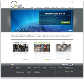
From the moment someone lands on the PHP homepage, he is aware that he has encountered a serious organization with international reach and impact and gets a very strong idea of what the firm stands for.
At the top are large rotating photos projects and company educational opportunities, each with a link to its own landing page. Below those is a two-sentence statement of the firm’s mission. And below that three smaller black-and-white photos, each with a caption and a link to more information. To attract attention, each of these photos turns to color as the mouse scrolls over. Thus, the homepage is inviting and easy to use, even for visitors who are not fluent in English.
From there, a visitor is launched on an adventure in public health that takes him around the world to the various projects and partners of Public Health Practice. Everything is interactive, with large photographs that convey much of the message.
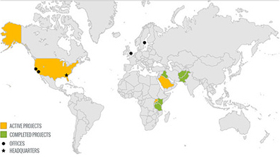
A world map, for example, shows the locations of both current and completed projects. As the mouse scrolls over the map, the name of location of the project becomes visible.

The market response
“In the short time the website has been up, we have already received many compliments on how polished it is,” said Park.
‘We’re very pleased with the outcome,” said Tanweer.
To experience this site first hand, please go to http://publichealthpractice.com.
Could your website be more interesting?
Do visitors who land on your website stay there? If not, maybe you need to make it more worth their while. If you’d like to know how to make your website more interesting, please email us at sales@nichelabs.com or call 866.413.7952.

