Spotlight: Clear Choice Inc.
 How a new website is helping Clear Choice Telephones send customers a clear message
When Michael and Jane Higgins decided that their website no longer adequately reflected their company, they wanted to do something radical.
The first step, one of the most laborious, was getting the copy just right.
“We didn’t want mindless chatter,” said Jane. “We wanted the copy to be meaningful.”
So, they hired a copywriter, Stan Schnitzer, who worked closely with Michael and other key people in the company to come up with copy that reflects what Michael calls “The Clear Choice Way” – “Do what is best for your customers and do it in ways they can understand.”
When looking at Atlanta website design firms, they selected NicheLabs to interpret their vision, partly on the basis of referrals and partly because they were “impressed with their knowledge.”
How to be dramatic in a cluttered market
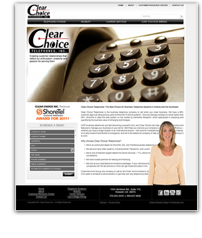
The Clear Choice homepage has several features intended to attract and keep visitors’ attention from the moment they land. With only one photograph, a gigantic close-up of a generic phone pad, the homepage has immediate impact.
“We went generic with the photo,” said Jane, “because we sell three different brands.”
The headline describes Clear Choice as “The Best Choice for Business Telephone Systems in Atlanta and the Southeast.” No mindless chatter here. With 1,100 active customers and a 98% customer approval rating, Clear Choice has the clear right to make this claim.
To keep visitors on the homepage, an attractive blond spokeswoman appears in front of the content and delivers the message that is presented consistently throughout the site:
- the three brands of business phone systems sold by Clear Choice
- the older brands they service
- the number to call for information
How to be intuitive and consistent
Another of Michael Higgins’ main goals was that the website support his vision by being intuitive and easy for customers to use. Since one of the goals of the site is to get visitors to schedule a demonstration, every page of the site – even the homepage – features a demo sign-up form.
In addition, the copy on every page ends with a call to action that includes the company phone number. To help maintain visitor interest, the spokeswoman appears on other pages throughout the site, reiterating the key messages.
How to be comprehensive but not overwhelming
Michael wanted his website to be a total support resource for his customers and do it in an intuitive and meaningful way. The Customer Resource Center was the solution. The spokeswoman greets visitors to this page and then disappears to reveal icons that lead to training videos, phone system manuals, white papers and news articles.
Clarity is the key for Clear Choice Telephones
“Thanks to NicheLabs, our website has gone from a liability to the cornerstone of our marketing efforts,” said Michael.
In an industry where change and confusion are common, Clear Choice Telephones opted for clarity of message and presentation in its new website and chose Atlanta website design firm NicheLabs to help them achieve it.
You are invited to visit at http://clearchoiceinc.com.
How about your website?
For information, please email sales@nichelabs.com or call 866.413.7952.
