Spotlight: The Graivier Center
An image to match the reputation of one of the world’s premier plastic surgeons
What do you do when you are a plastic surgeon so talented you have a six-month waiting list and speaking engagements that take you all over the world – and an out-of-date website that barely hints at the prestige associated with your name?
You rebrand – and you do it with a brand-new website designed by Atlanta website design firm NicheLabs.
Working with Atlanta brand strategist Karen Pardue, Dr. Miles Graivier and his staff completely rebranded his practice with a new name, a new logo, new colors and a new website, which went live on Aug. 24.
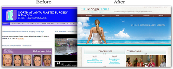
Before and after
Everybody is familiar with the typical before-and-after photos used on most plastic surgeon’s websites. However, Dr. Graivier and his team decided to dispense with such photography for the new site. After all, why show the befores when the afters are so beautiful?
However, a look at the old and new homepages reveals one before-and-after comparison that shows a total transformation:

The rebranding process
The purpose of the rebranding was to have everything associated with Dr. Graivier reflect his reputation as one of the world’s premier plastic surgeons.
Focus groups made clear that Dr. Graivier is the reason people come to his practice. They would rather wait for months to see him than see anyone else.
“When 80% of your business is return patients,” said Pardue, “you know people are coming specifically to see you.”
So, the rebranding started with a name change. Though The Graivier Center is a solo practice, the former name, North Atlanta Plastic Surgery and Day Spa, sounded like a typical large suburban medical practice, with multiple doctors, with no hint of Dr. Graivier’s super-star status.
The new name,” said Pardue, “lets you know who you will see when you come to this practice.”
The new name – The Graivier Center – needed a new logo, which Atlanta freelance art director John Wieschhaus designed using the new brand’s fashionable natural colors, Tiffany blue and deep chocolate brown.
How a website can bring a brand to life
The next step was to create a website that made the new brand come to life. Here is where NicheLabs entered the picture. President Todd Withrow participated in some of the “brand-storming” sessions and “got it,” according to Pardue.
The result is a WordPress website that says beauty and youth throughout. Everything in the new site is aimed at expressing and building Dr. Graivier’s brand – from the glamorous photos of beautiful people to the chic colors.
How a website can inspire and educate
Plastic surgery patients tend to self-educate before deciding on a procedure and like to stay informed about what’s happening in the world of cosmetic surgery. Therefore, a CMS site was a necessity. NicheLabs trained key members of the staff on how to use the system so they can post news on the latest procedures and technologies as soon as they become available at the practice.
And since patients in focus groups said that due to Dr. Graivier’s international reputation and skill they want to follow his speaking career, the site will also feature Dr. Graivier’s speaking engagements to show where he is speaking and on what topics. WordPress will allow staff members to update these regularly without the need for outside help.
With such devoted patients, Dr. Graivier and his team decided to let them speak for themselves. So, the homepage features a video of some very happy, beautiful clients singing his praises. Any woman considering plastic surgery would be inspired and comforted by their stories.
To view the whole beautiful website, please go to http://thegraiviercenter.com.
Does your website adequately reflect your brand?
For information, please email sales@nichelabs.com or call 866.413.7952.
